CASE STUDY
Designing decentralized insurance from the ground up
Key Outcome
From MVP to +$100M Total Locked Value in 6 months
Strategic mission
Over 6 months, I designed the complete user experience from scratch: information architecture, core product flows, a design system, and a landing page. All while making a deeply technical protocol feel approachable to both capital providers and cover buyers.
- 3
- Team Members
- 6 months
- v1 build
- +$100M
- TVL
Smart contract, design, full stack dev
From design and frontend implementation to launch
Total Locked Value of deposited cover policies at launch
The Project
Unslashed Finance was a decentralized insurance protocol that let anyone buy coverage against smart contract failures, exchange hacks, oracle malfunctions, and stablecoin depegs.
On the other hand, capital providers could deposit collateral to earn a yield while providing coverage. Claims were resolved through Kleros, a decentralized arbitration layer, making the entire process trustless and transparent.
The protocol launched with $100M+ in total value locked.
The project is now discontinued, but the work remains a strong example of designing complex financial systems under constraints: a small team, a new category, and high stakes.
Tools
Figma, Linear, Webflow, Jitter
The Challenge
A working MVP, no real user experience
2020 was early for DeFi. Most protocols shipped bare-minimum interfaces, and users were eager to explore but hesitant to commit capital when the UX felt unpolished.
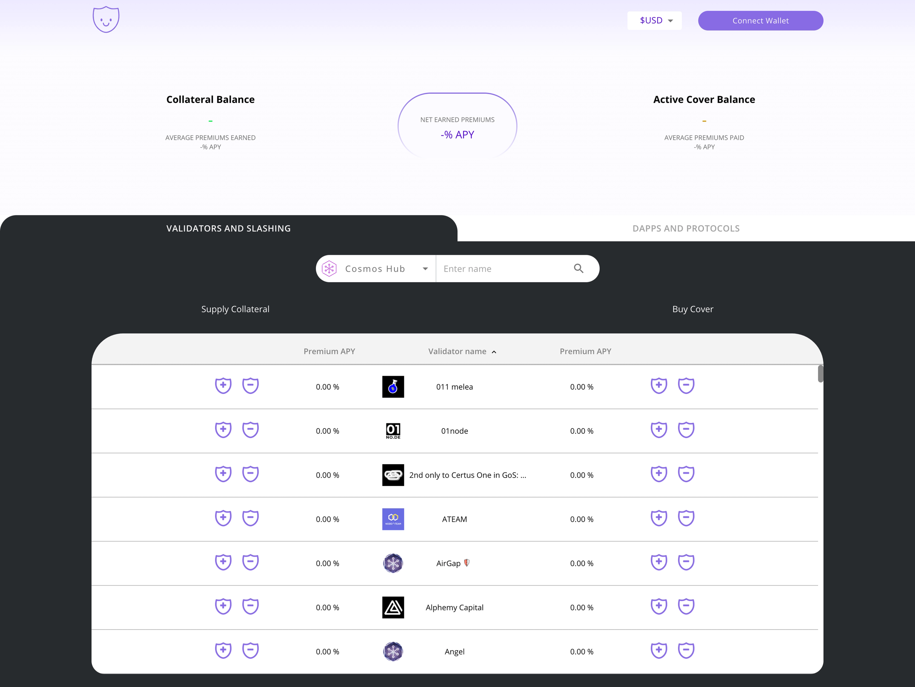
Before I joined, the team had a functional protocol, but the interface was a raw smart contract wrapper that barely showcased its capabilities. The UX didn't match the ambition.
On the right side, you can see the MVP version of the UI, it’s a one-screen UI that validates the utility and raised VC funds, but it wasn’t mature enough to gain trust and adoption.
Research & Discovery
Understanding what DeFi users actually need from insurance
Through 1:1 interviews, competitive analysis of Nexus Mutual and Cover Protocol, and jobs-to-be-done mapping, I identified the core tension: users understood the coverage conceptually but couldn't evaluate what they were actually protected against.
Trust wasn't just about smart contract security. It was about whether the interface communicated risk clearly enough to commit capital.
Competing protocols prioritized functionality over clarity. The opportunity was to make the experience self-explanatory for cover buyers and capital providers
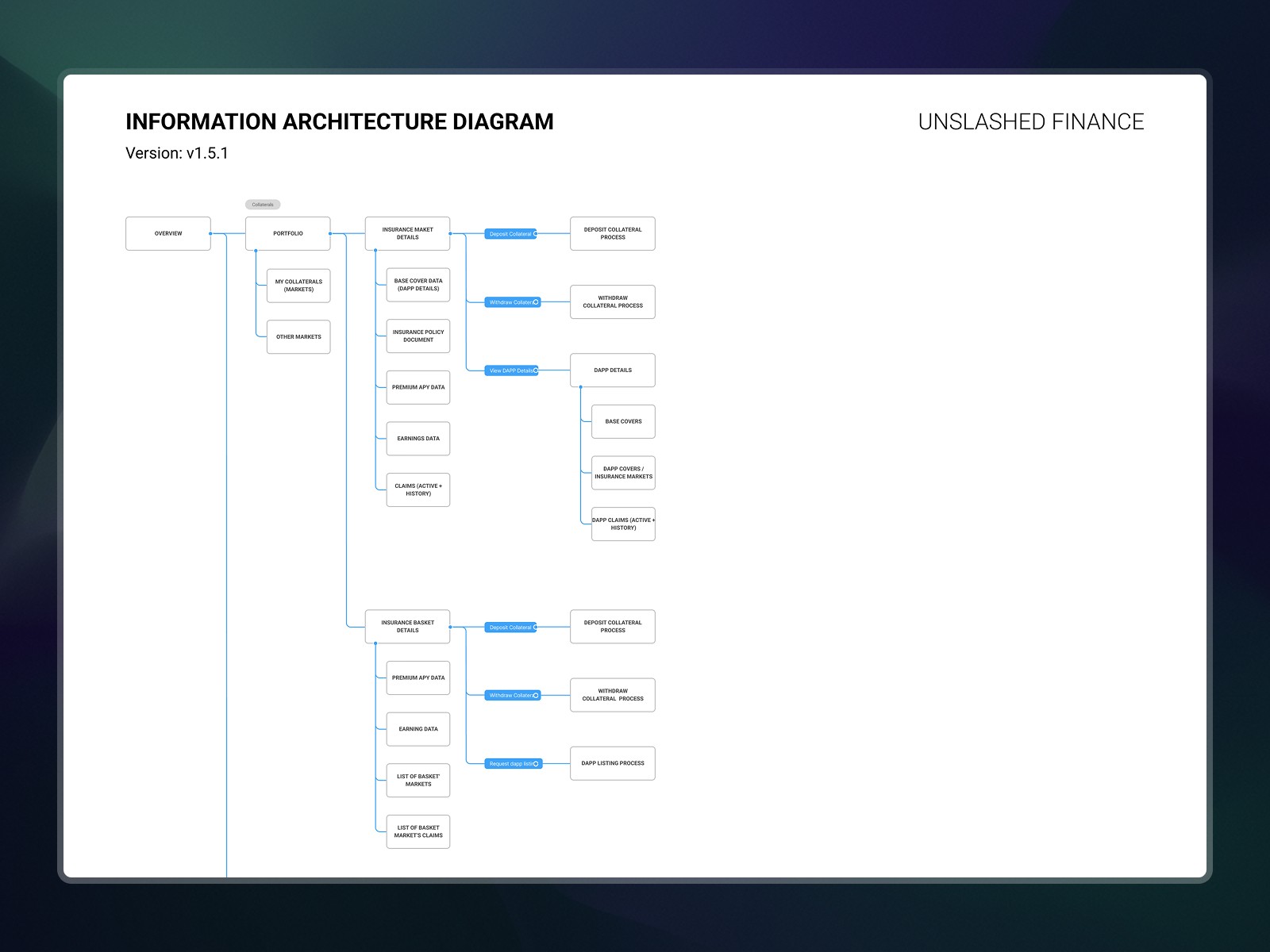
Information architecture
Mapping a protocol with two very different user types
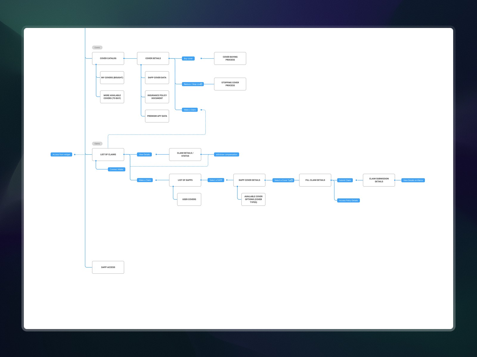
The first step was untangling the product's complexity. Unslashed serves two audiences with opposing mental models: capital providers seeking yield, and cover buyers seeking protection.
I mapped every state, flow, and relationship across the protocol: collateral management, cover purchasing, claims filing, dispute resolution, and policy documentation. This IA became the foundation for every design decision that followed.
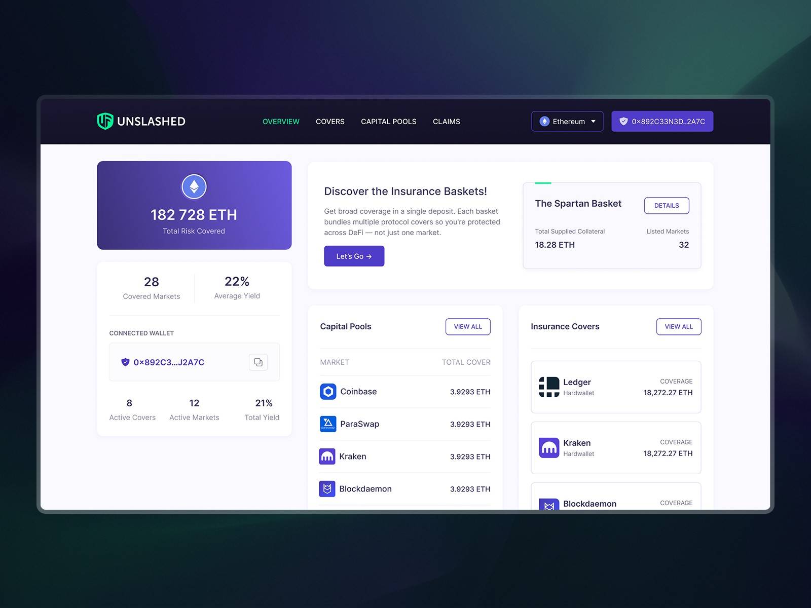
Experience design
Three core workflows, one coherent product
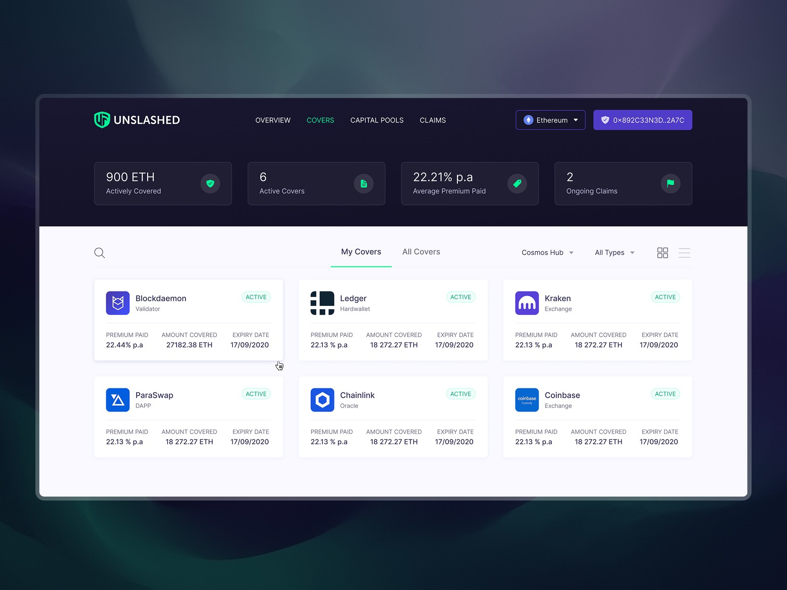
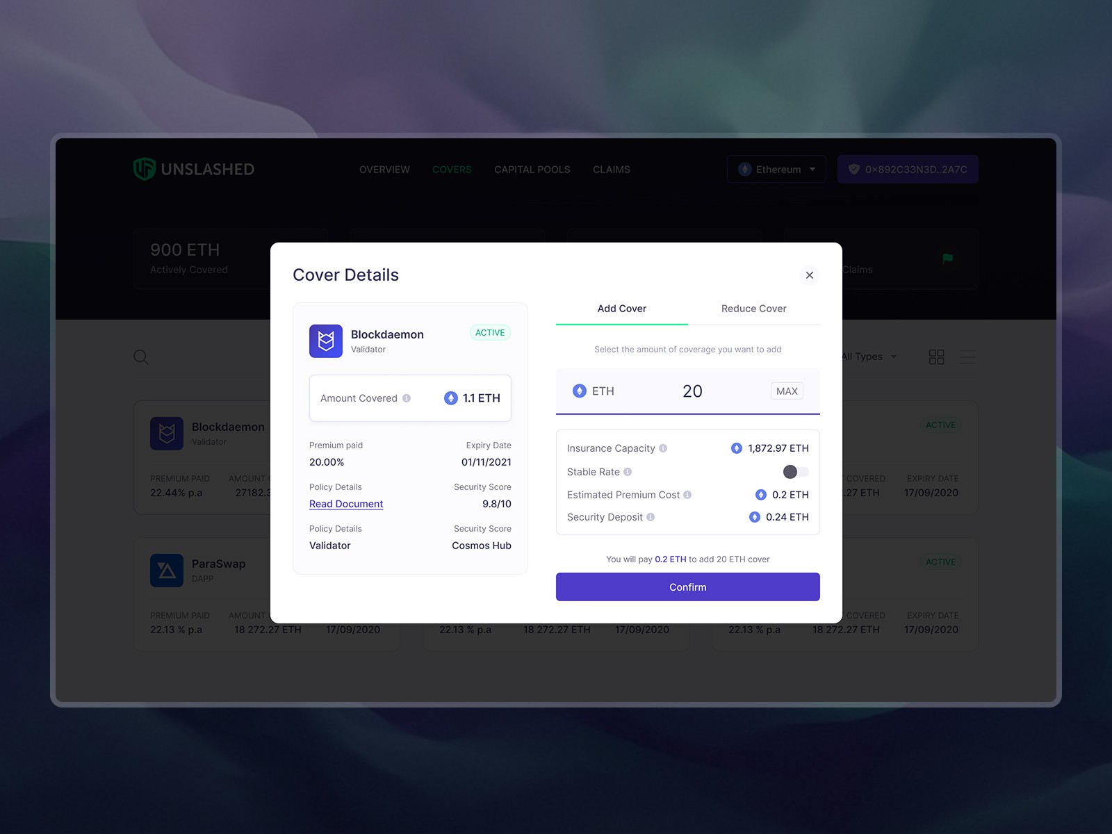
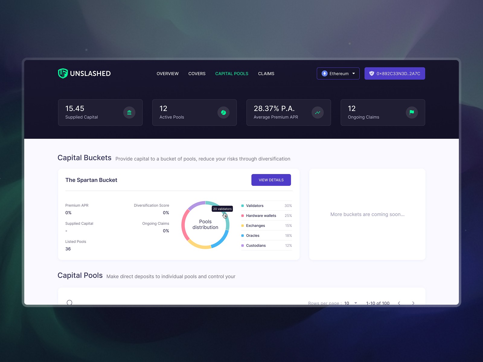
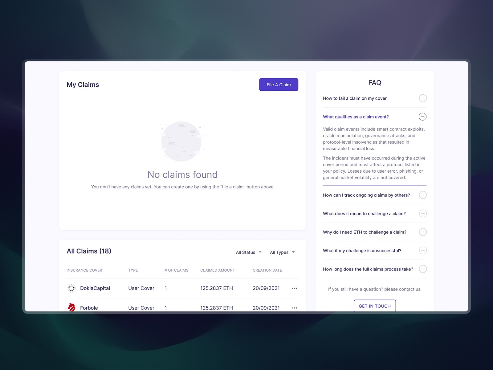
The platform supported three core journeys: Collaterals, where capital providers deposit into markets, track APY, and manage withdrawals. Covers, where buyers browse, purchase, and manage protection policies. And Claims, where users file incidents and navigate deposit requirements, challenge periods, and dispute resolution through Kleros arbitration.
Deep dive
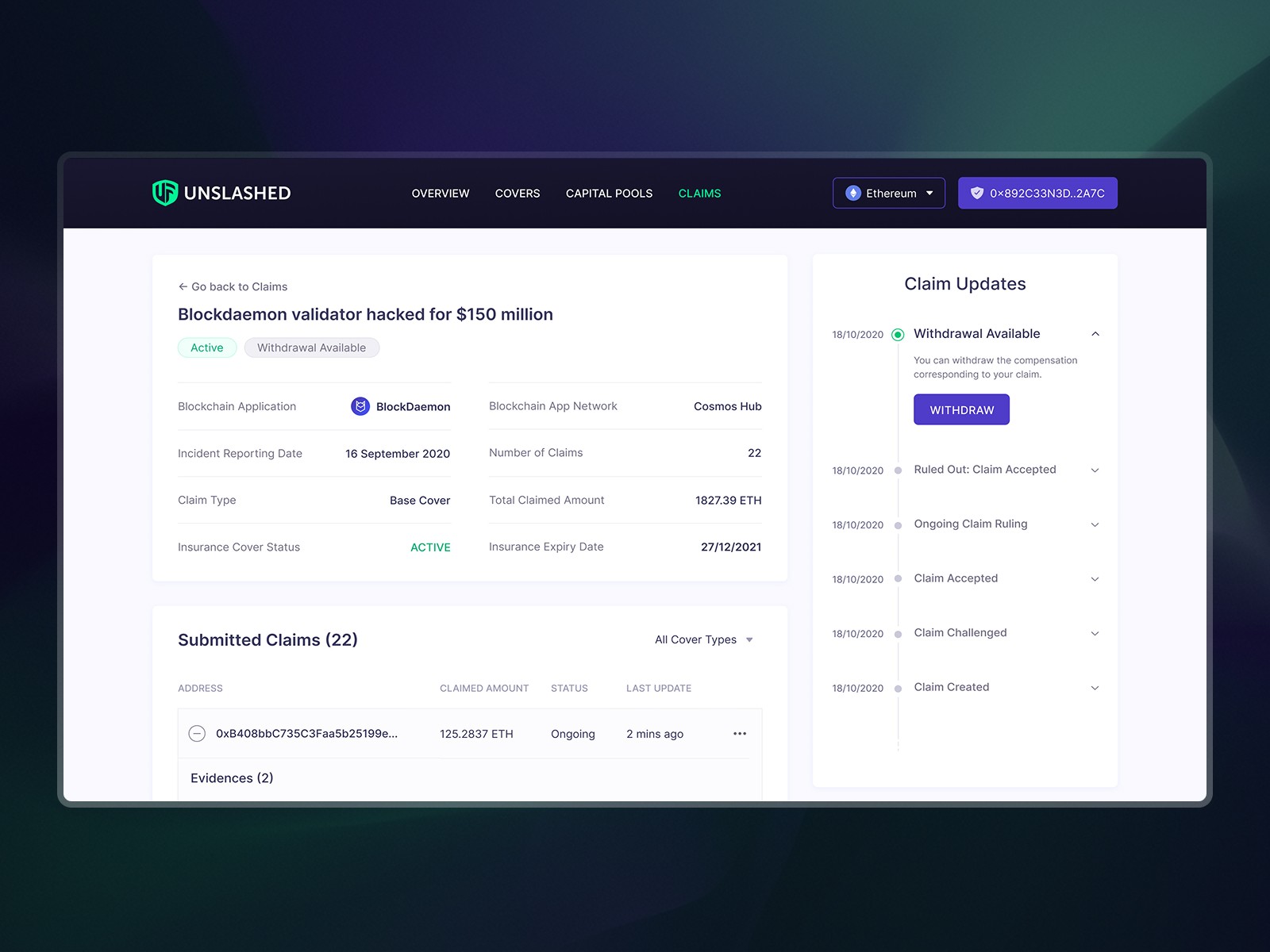
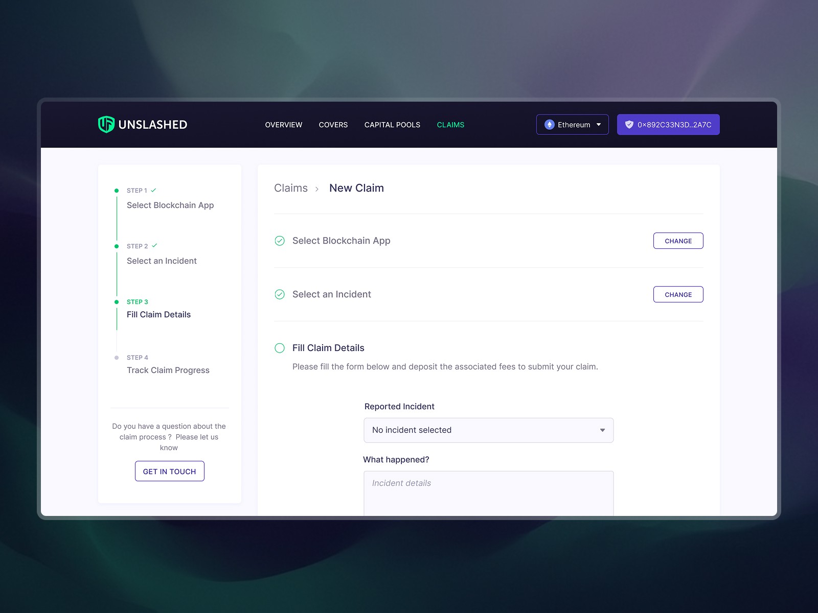
Claims Flow: designing trust into a trustless system
The claims process was the highest-stakes flow in the product. I designed a step-by-step guided experience: select protocol, choose incident type, specify compensation, understand deposit requirements, and submit. Every step surfaces the right context at the right time, because in DeFi, clarity is the difference between trust and abandonment.
If a claim gets challenged, it enters Kleros arbitration. The UI needed to communicate status transitions, evidence windows, and appeal mechanics without overwhelming the user.
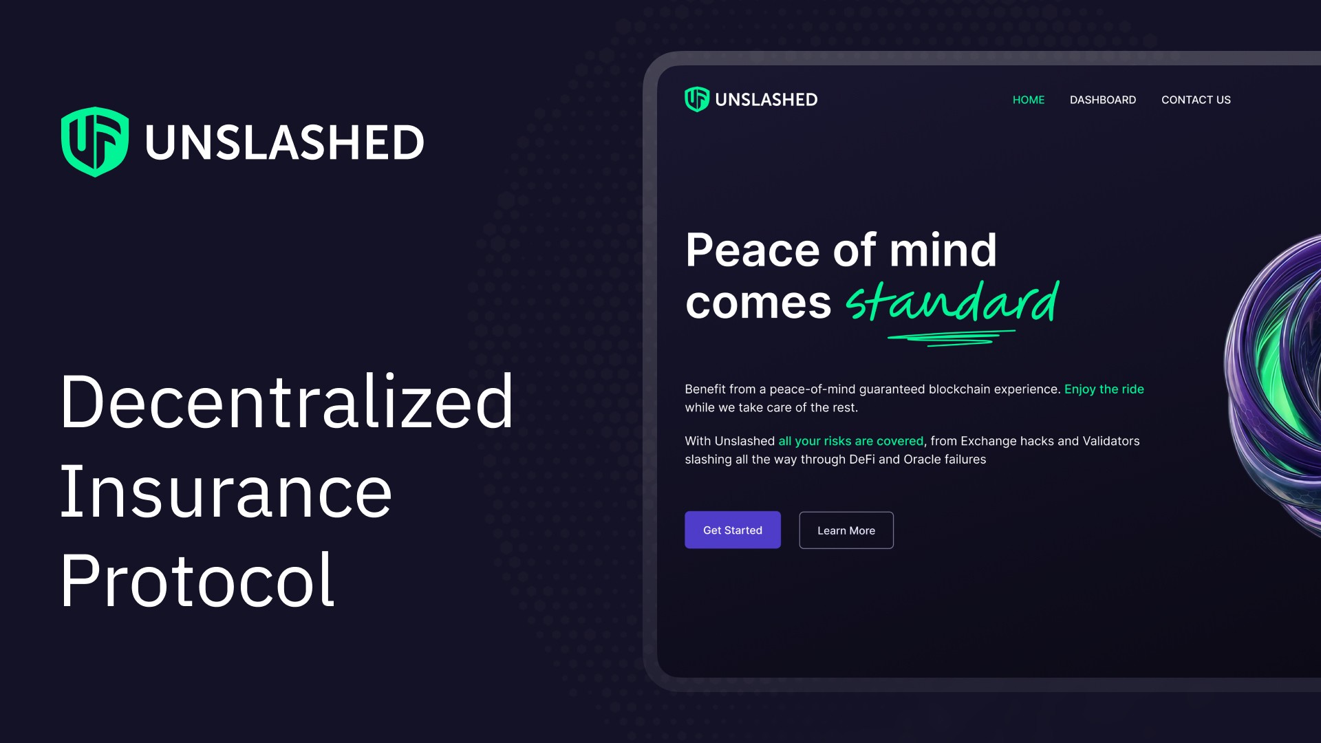
Landing Page: first impressions convert
I designed and built a landing page using Figma and Webflow to give the protocol a credible front door. The goal was to turn curious DeFi users into cover buyers and capital providers by communicating the value proposition clearly and inspiring trust from the first interaction.
Other Case Studies
Designing Velora Trading Widget
Velora ParaSwap Rebranding Strategy
Ready to collaborate?
Let's discuss how we can build something impactful together.
Get in touch